

Du hast ein starkes Design erschaffen – doch sobald es in einem Mockup platziert wird, wirkt es plötzlich matt, leblos oder einfach… nicht stimmig.

Was ist ein Mock-up

Ein Mockup ist eine realistische Darstellung deines Designs in einem passenden Kontext – digital oder physisch. Es zeigt nicht nur, wie dein Design aussieht, sondern auch, wie es beim Betrachter wirkt. Das ist die kurze Erklärung, die du zunächst brauchst.
Es gibt außerdem verschiedene Arten von Mockups, zum Beispiel:
-
Produkt-Mockups (z. B. Verpackungen, Kleidung oder Merchandise)
-
Screen-Mockups (für Websites, Apps oder digitale Interfaces)
-
Print-Mockups (Poster, Flyer, Visitenkarten usw.)
Jede Art erfüllt einen anderen Zweck – gemeinsam sorgen sie jedoch dafür, dass dein Design durch Kontext und Stimmung beim Betrachter wirkt und verbindet.
Die Macht der Visuellen Wirkung
Ich möchte dir anhand des folgenden Beispiels zeigen, wie kraftvoll visuelle Elemente bei der Präsentation eines Designs sein können. Manchmal ist es nicht das Design selbst, das Menschen anzieht – sondern wie es gezeigt wird.
Warum finden wir bestimmte Bilder sofort ansprechend, während andere flach oder uninteressant wirken? Oft liegt es an subtilen, aber entscheidenden Faktoren wie Beleuchtung, Hintergrund, Textur und Komposition. Diese Elemente beeinflussen unsere Wahrnehmung auf emotionaler Ebene und bestimmen, wie professionell, vertrauenswürdig oder begehrenswert etwas wirkt.
Ein gutes Mockup zeigt dein Design nicht nur – es erzählt eine visuelle Geschichte, die die Sinne des Betrachters anspricht. Und genau das macht den Unterschied.
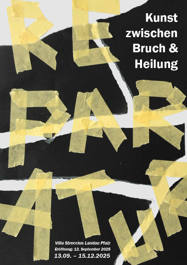
Dieses Plakatdesign entstand im Rahmen eines Studienprojekts zur Materialerprobung und Typografie. Es besticht durch eine markante, kantige Ästhetik mit starkem Schwarz-Weiß-Kontrast und spielt mit typografischer Hierarchie – große, auffällige Schrift trifft auf kleinere, detaillierte Texte. Das Ergebnis ist grafisch und dynamisch.
Das Plakat behandelt das Thema „Reparatur“ und erforscht die Spannung zwischen Zerstörung und Heilung. Dies wird durch ein fragmentiertes, zerrissenes Layout visualisiert und mit „gekleisterter“ Typografie wieder zusammengesetzt – wobei das Klebeband buchstäblich als Schrift eingesetzt wird.
Der Schwarz-Weiß-Hintergrund bildet einen starken Kontrast zur gelben Klebeband-Typografie und erzeugt eine visuelle Spannung, die das Thema der Ausstellung aufgreift.
Nachdem wir kurz die visuelle Sprache und den emotionalen Ton des Plakats betrachtet haben, geht es im nächsten Schritt darum, eine Mockup-Umgebung zu finden, die diese Botschaft unterstützt und verstärkt.

Bevor du ein Mockup auswählst, nimm dir einen Moment Zeit, um deine eigene Arbeit zu analysieren. Frag dich dabei:
-
Welche Botschaft soll dieses Design vermitteln?
-
Welche Emotionen oder Assoziationen soll es hervorrufen?
-
Für wen ist es gedacht – und wie soll diese Person sich dabei fühlen?
Wenn du verstehst, wie dein Design mit deinem Publikum kommuniziert, bist du einen Schritt näher daran, ein Mockup zu finden, das Ton, Stimmung und Zweck deines Designs perfekt unterstützt
Fehler dieses Mockups: Visuelle Unstimmigkeit
Ich möchte dir mit diesem Beispiel zeigen, wie leicht falsche visuelle Elemente von deinem Design ablenken können – selbst wenn das Layout selbst sauber und ausgereift ist.
Dieses Plakat ist eine Werbung für eine Kunstausstellung mit dem Titel „Reparatur – Kunst zwischen Bruch & Heilung“. Das Design ist mutig, roh und ausdrucksstark. Rau gezerrissene Kanten, starker Schwarz-Weiß-Kontrast und gelbe Klebeband-Typografie spiegeln die Themen von Schaden und Reparatur wider.
In diesem Mockup unterstützt der Hintergrund jedoch nicht die Botschaft. Die sanften, romantischen Blumen und die helle, dekorative Umgebung wirken völlig losgelöst vom Thema „Reparatur“ und „Bruch“. Es gibt keine visuelle oder emotionale Verbindung zwischen dem Inhalt des Plakats und der Ästhetik der Umgebung.
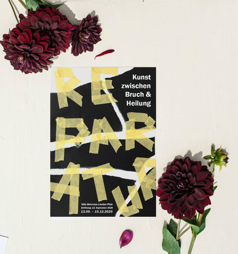
Da das Design selbst so ausdrucksstark und thematisch ist, muss die Mockup-Umgebung diesen Ton unterstützen und widerspiegeln. Industrielle Texturen, rohe Wände oder minimalistische, neutrale Hintergründe würden seine Botschaft verstärken.
Wird es hingegen zwischen romantischen Blumen oder polierten Lifestyle-Objekten platziert, wie in deinem zweiten Beispiel, schwächt das die Wirkung des Designs und erzeugt eine visuelle Dissonanz

Meiner Meinung nach würde ein Hintergrund mit roher oder unpolierter Textur die Botschaft dieses Plakats stärken. Er erzeugt ein visuelles Echo des Themas – etwas Zerbrochenes, Unvollkommenes, das dennoch zusammengehalten wird. Eine solche Umgebung wirkt ehrlich und emotional im Einklang mit dem Motiv.
Natürlich spricht diese Art der Darstellung nicht jede*n an. Manche könnten sagen: „Aber mir gefällt das Mockup mit den Blumen!“ – und das ist völlig in Ordnung. Aber hier lohnt es sich, eine Frage zu stellen:
Gefällt es mir, weil es zum Design passt – oder weil ich einfach Blumen liebe?
Persönlicher Geschmack ist völlig legitim. Doch beim Auswählen eines Mockups ist es wichtig, einen Schritt zurückzutreten und zu überlegen: Unterstützt diese Umgebung die Geschichte, die mein Design erzählt – oder lenkt sie nur davon ab?
Vermeide überladenen Bilder
In diesem Beispiel zeige ich mein eigenes fotografiertes Mockup für ein Gesundheitsmagazin. Die Komposition an sich ist visuell ansprechend und sorgfältig gestaltet – aber hier ist der entscheidende Punkt: Das Magazin muss im Mittelpunkt stehen.
Wenn das Gesamtbild zu unruhig oder ablenkend ist, geht das Magazin in der Komposition unter. Deshalb gilt das Prinzip „Weniger ist mehr“ – ein vereinfachtes Mockup lässt dein Design wirklich hervorstechen und zieht die Aufmerksamkeit der Betrachter*innen sofort auf sich.
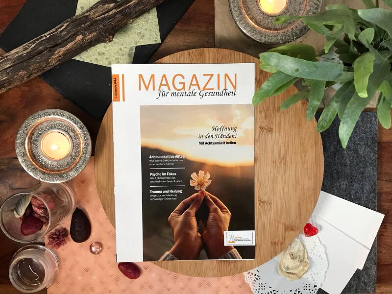
Wenn ein Mockup zu überladen ist, weiß die Betrachter*in nicht, worauf sie den Fokus legen soll, und die Präsentation deines Designs verliert an Wirkung. Überlege dir, wie du möchtest, dass dein Mockup erlebt wird – idealerweise sollte dein Design bereits in wenigen Sekunden verstanden und geschätzt werden.
Ein Mockup mit vielen Elementen ist nicht zwangsläufig falsch, aber du solltest bedenken, wo du es präsentierst. Auf Plattformen wie Pinterest, wo Nutzerinnen schnell durch zahlreiche Bilder und konkurrierende Designs scrollen, wird ein überladenes Mockup wahrscheinlich übersehen. Präsentierst du dein Design hingegen auf einer eigenen Website, auf der sich die Besucherinnen mehr Zeit nehmen, kann ein detaillierteres Mockup besser funktionieren.
Kurz gesagt: Passe die Komplexität deines Mockups an die Plattform und dein Publikum an, um die Wirkung deines Designs maximal zu entfalten.
Farbharmonie in einem Mockup
Sprechen wir über die Farbkomposition eines Mockups
Farbe spielt eine entscheidende Rolle dabei, wie dein Design innerhalb eines Mockups wahrgenommen wird. Wenn du Farben bewusst auswählst, die dein Design unterstützen und ergänzen, entsteht eine stimmige und visuell ansprechende Präsentation.
Tipps zur Farbkomposition in Mockups
Wähle 1–2 Hauptfarben aus deinem Design
Nutze diese Farben, um den Hintergrund und die umliegenden Elemente deines Mockups zu gestalten.
2. Neutrale oder gedämpfte Hintergründe für bunte Designs verwenden
Wenn dein Kunstwerk lebendig und farbenfroh ist, wähle Hintergründe in Grau, Beige oder sanften Weißtönen, um visuelle Konkurrenz zu vermeiden.
3. Stimmung und Thema berücksichtigen
Passe die Farben des Mockups an die Stimmung deines Kunstwerks an – warme Töne für gemütliche Designs, kühle Töne für ruhige und professionelle Looks.
4. Kontraste nutzen, um dein Design hervorzuheben
Achte auf ausreichend Kontrast zwischen deinem Design und dem Hintergrund, damit dein Werk im Fokus bleibt.
5. Zu grelle oder unharmonische Hintergründe vermeiden
Manche Farben, wie bestimmte Pastelltöne oder sehr gesättigte Farbtöne, können mit deinem Design kollidieren. Teste die Kombination immer, um Harmonie zu gewährleisten.
6. Das Prinzip „Weniger ist mehr“ anwenden
Halte die Farben des Mockups schlicht, damit dein Design hervorsteht und die Betrachter*in nicht überfordert wird.

Zum Beispiel…
Wenn ich Plakate für Werbezwecke gestalte, wähle ich immer einen Hintergrund und ein Setting, das sowohl zum Thema als auch zu den Farben des Designs passt. Ich halte alles einfach und reduziert – nichts, das von der Hauptbotschaft ablenkt. In einem Fall war die einzige Farbe, die in der gesamten Komposition herausstach, ein Stück gelbliches Klebeband. Es setzte gerade genug Kontrast, um Aufmerksamkeit zu erzeugen, ohne das Gesamtbild zu überwältigen.
Während ich diesen Artikel schrieb, habe ich mir dieses Mockup noch einmal angeschaut und festgestellt, dass der Kontrast zwischen Magazin und Hintergrund nicht stark genug war. Es hätte mehr Schatten gebraucht, um Tiefe zu erzeugen und das Design hervorzuheben.
Und das führt mich zu meinem nächsten kurzen Tipp…

Kurzer Tipp: Lass dein design einen Tag ruhen
Manchmal hilft es, einen Schritt zurückzutreten und dein Werk für eine Weile ruhen zu lassen, um neue Perspektiven zu gewinnen. Deinem Design Zeit zu geben, „zu ruhen“, hilft dir, Dinge zu erkennen, die du im Moment vielleicht übersehen hast – sei es Farbbalance, Kontrast oder Komposition. Ein frischer Blick, selbst wenn es dein eigener ist, kann einen großen Unterschied machen.
Abschließende Gedanken: ein mockup ist ein kommunikationsmittel
Am Ende des Tages ist ein Mockup mehr als nur ein hübscher Rahmen für dein Design – es ist ein Kommunikationsmittel. Es zeigt den Zweck, den Kontext und das Potenzial deiner Arbeit. Ein gutes Mockup hilft den Betrachter*innen, dein Design zu verstehen, nicht nur zu sehen.
Egal, ob du es einem Kunden präsentierst, online veröffentlichst oder deinem Portfolio hinzufügst – frage dich immer: Hilft dieses Mockup dabei, die Geschichte meines Designs klar und überzeugend zu erzählen? Wenn die Antwort ja lautet, bist du auf dem richtigen Weg.
Ich möchte dir meine Fine Art Prints ans Herz legen
Einige meiner Kunstwerke findest du in meinem Etsy-Shop oder direkt auf dieser Website. Wenn du dich in meinen unverwechselbaren Stil verliebst, schau gern in meinem Shop vorbei. Ich bin auch gespannt, was du von diesem Artikel hältst – hinterlasse gerne einen Kommentar unten.
Mit Liebe
Jenny

Kommentar hinzufügen
Kommentare